EVOLUTION OF AN IOS APP
As Grabble Words enters a second and final beta phase, it’s interesting to look back at how far its come – despite not launching yet!
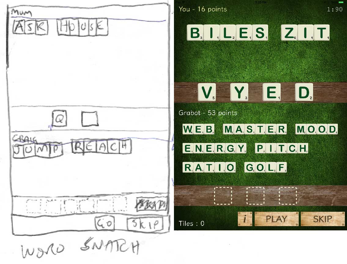
Here’s my initial diagram of game play, along with a current screenshot. Not far off, a few changes. You can see I was playing with the name ‘Word Snatch’ early on.
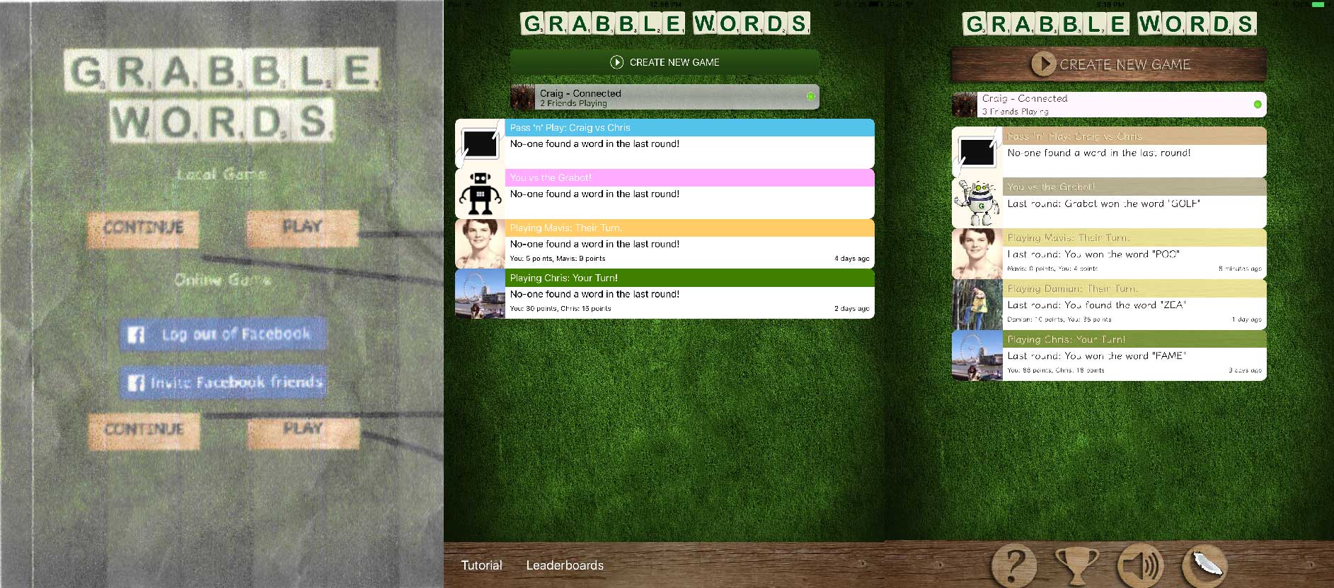
Here’s the evolution of the title screen. Unfortunately I could only dig up a print out of the very first iteration, so quality isn’t so good. As you can see app was structured differently initially. The second version of the title screen comes from the first beta that many of the beta testers will find familiar. I decided for usability and convenience to show all active games straight away on the title screen. The third version of the title screen is the current state of the app. Many buttons have been turned into symbols, with wooden textures. I know graphic design trends have been moving towards flat design, but I guess I still love textured designs, it somehow feels more timeless. Long live skeuomorphism!
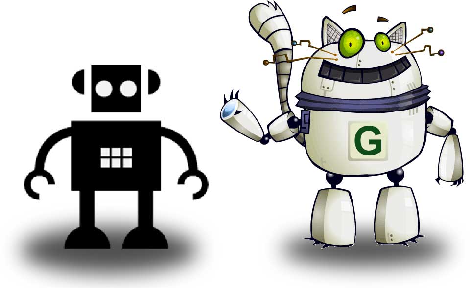
Finally, the evolution of the Grabot! To be honest the Grabot was an afterthought – I needed a symbol to represent playing against the computer, so I came up with a robot looking symbol and called it the Grabot. But after some weeks I suddenly had a brainwave – my friend Mike Hughes(an exceptional illustrator) had illustrated a robot cat for me for another project that never made it to completion. Suddenly the Grabot was more than a mere symbol, he’s a character, the mascot of the game!
Shall be interesting to see where the app goes from here!
If you’d like to join the beta, register here.
Sorry, the comment form is closed at this time.